
December 2011 - September 2012
Web designer
In a large open space, tapes buzzed around the clock, plasmas flashed with live broadcasts, and all this had to be packaged into a neat, fast, understandable visual system. There, for the first time in practice, I felt that news design is about pace, grid discipline and respect for the text.
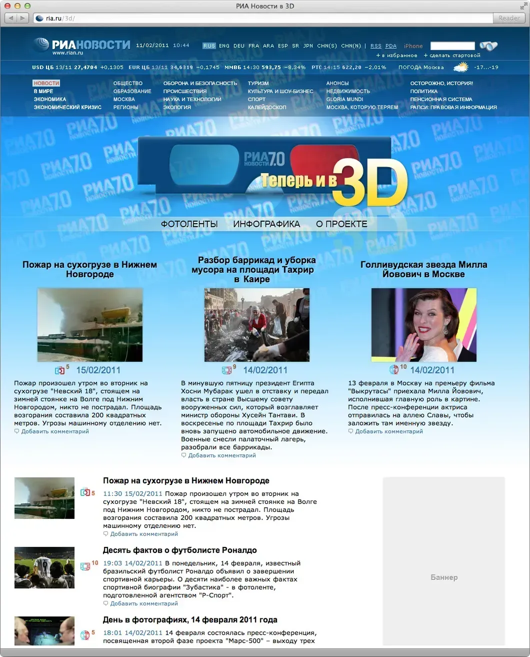
We put together clean typography and a modular grid for the portal, which supported both longreads and short summaries. I created covers for special projects, icons, infographics, promo blocks for live broadcasts, and set up visual accents for different scenarios: “urgent,” “opinion,” “photo of the day.”
This was the same “transitional” web - before retina and Figma: a lot of Photoshop, a lot of manual accuracy and eternal checking pixel by pixel.
Official portal of the company
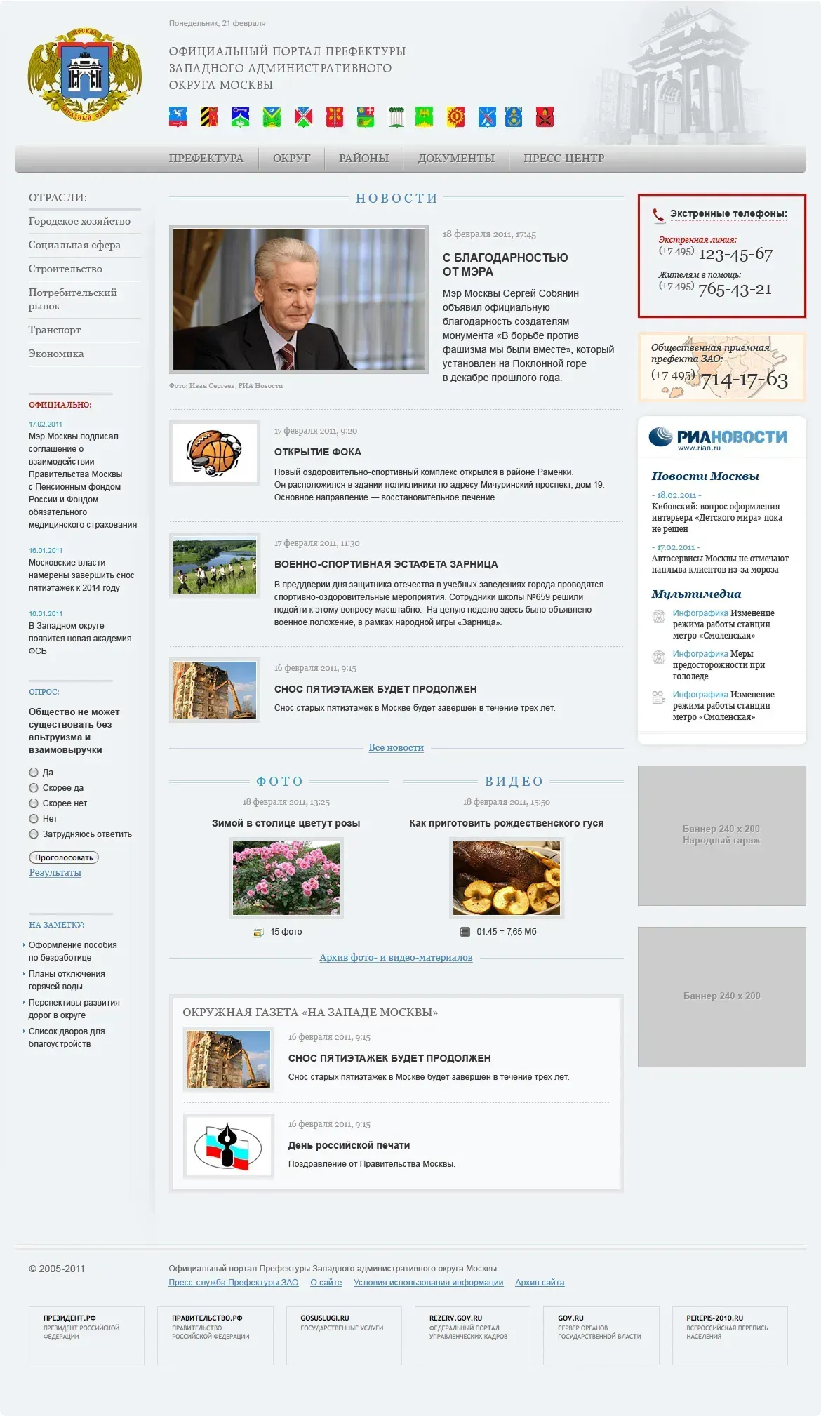
Separate Love - the official portal of the prefecture of the Western Administrative District of Moscow. It would seem like a regional portal, but we approached it as a small editorial office: local news, service pages, maps, event rubricator. I made prototypes and layouts so that the area could “breathe” with its own rhythm, but at the same time remain native to the overall RIA Novosti ecosystem. It turned out to be lively and practical: less “showcase”, more useful.
Now I have old screenshots and sketches from that time - you can see how I got my hands on editorial typography, learned to assemble long pages without visual noise, and maintain a balance between speed of release and cleanliness of the interface.
For me, RIA Novosti became one of the first serious schools: there I realized that good news design is not about decoration, but about clarity, context and respect for the reader.


Discussion