
June 2019 – July 2023
Side project of wife and her friend
Yulia and Irina are the authors of the project

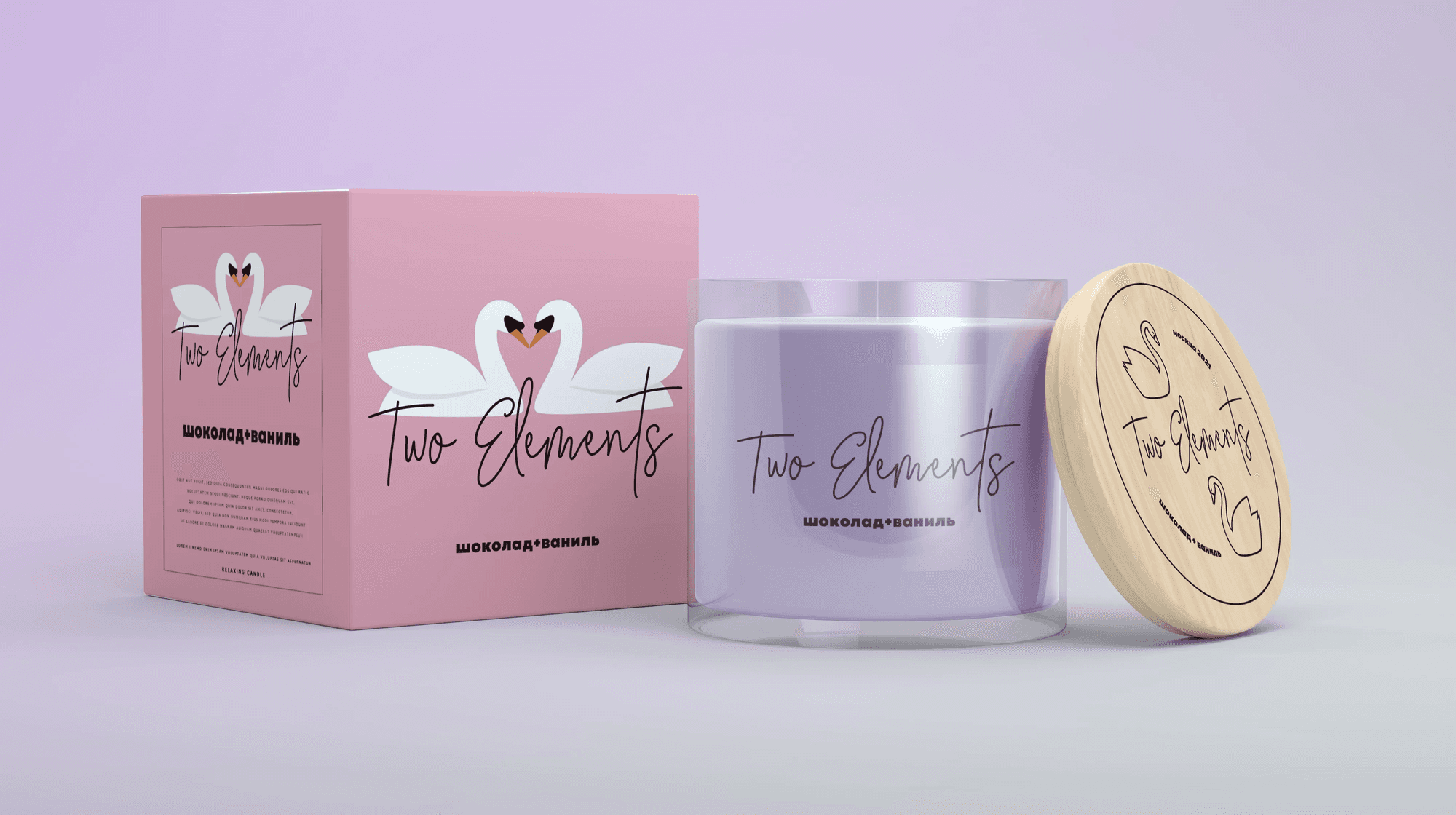
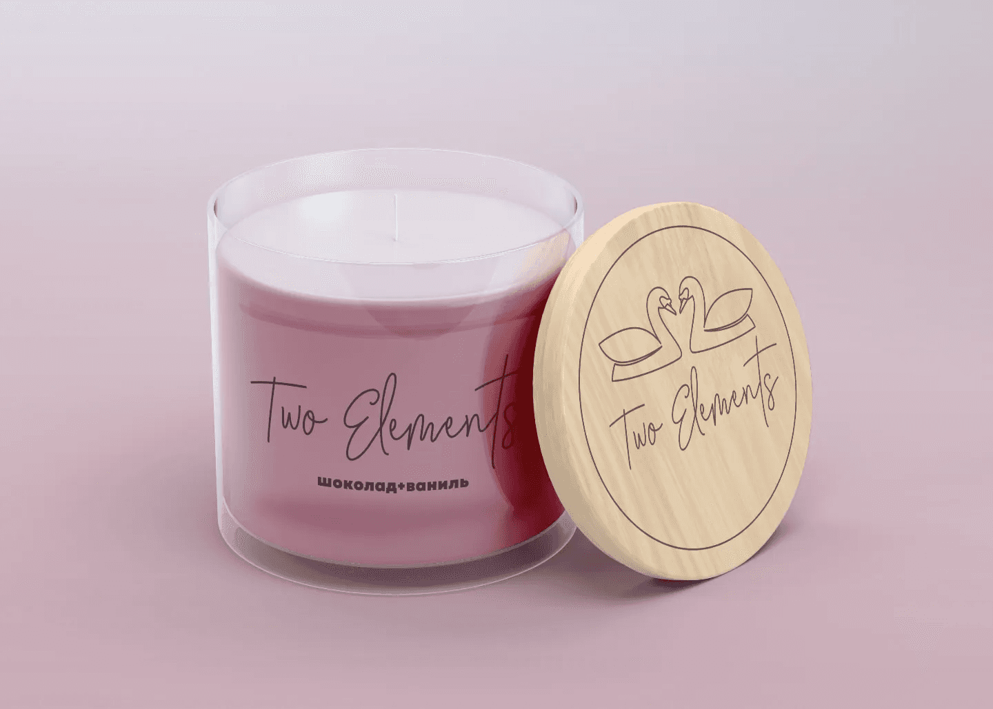
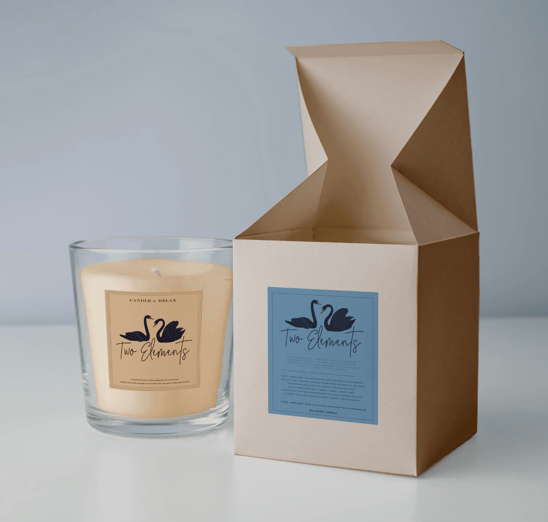
Sign and style
In the center is a minimalist logo: two swans forming a heart. It's about balance, connection and warmth. The soft pastel palette, handwritten accents and clean packaging layouts give a sense of intimacy and a grown-up aesthetic. The brand becomes recognizable and warm at first sight.
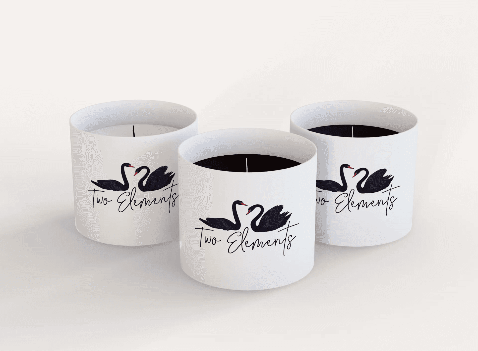
Premium option
Option of a premium collection or a collection for men with black wax.
Package
The identity is deployed throughout the entire system: candle jar, wooden (oak) lid, box. Everything speaks the same visual language - from the logo to the font - and turns the candle from a “product on the shelf” into a small ritual.
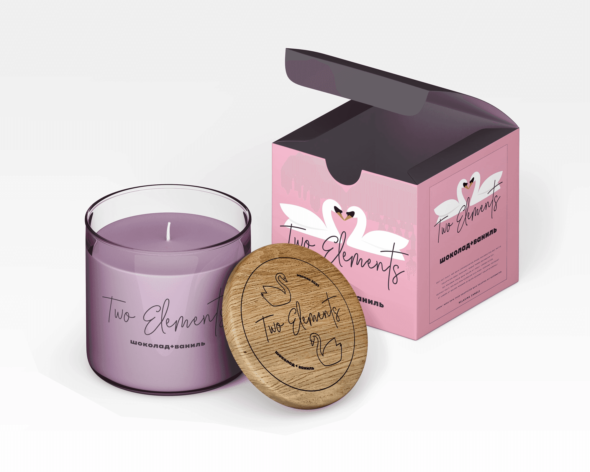
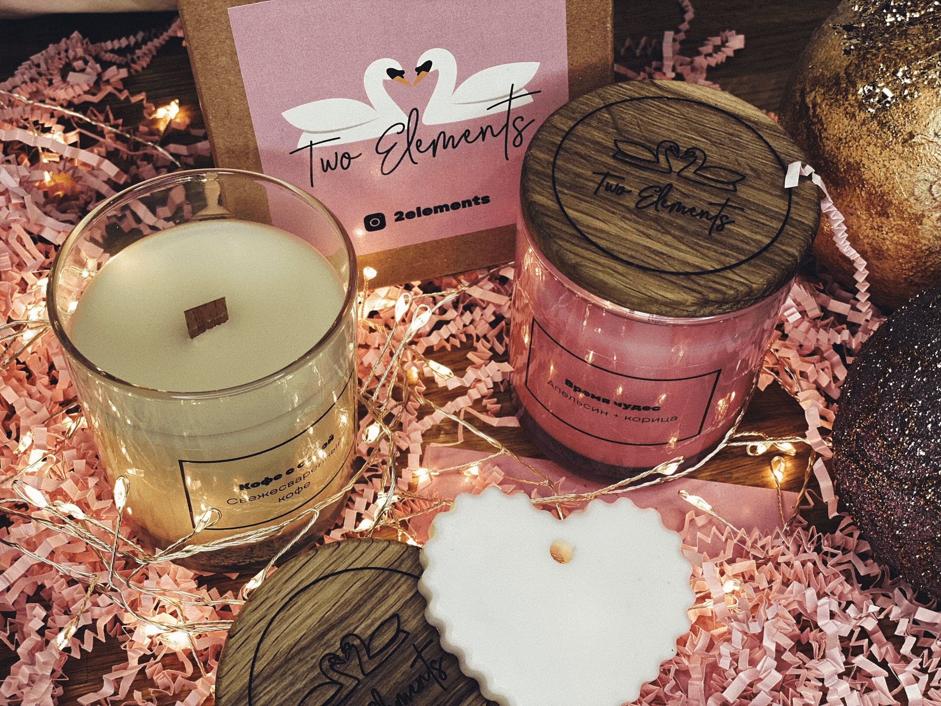
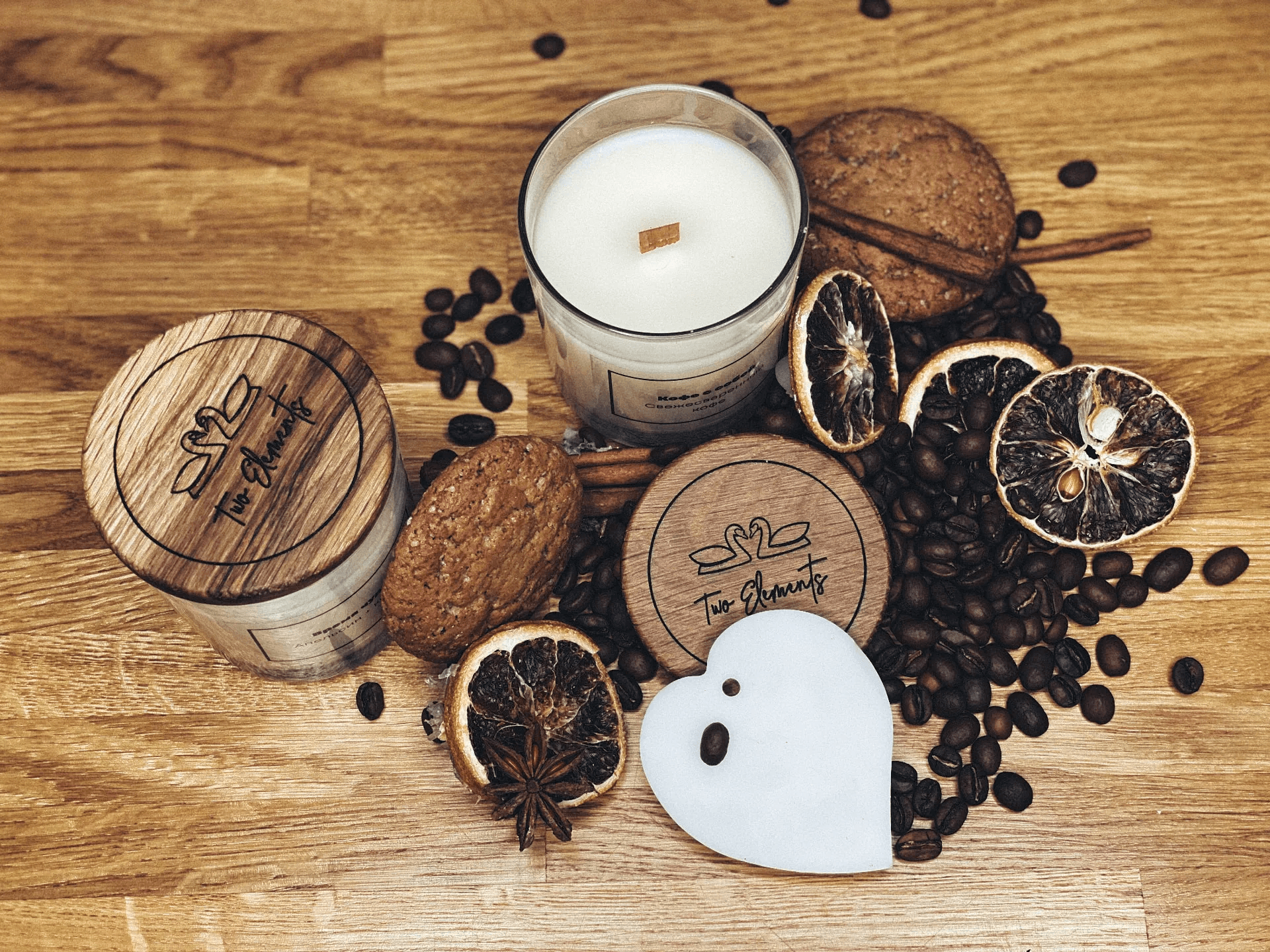
What it looks like in real life
The result turned out great. The packaging feels dense and premium, and the oak lids with laser engraving are absolutely stunning: a detail that immediately elevates the perception of the product.
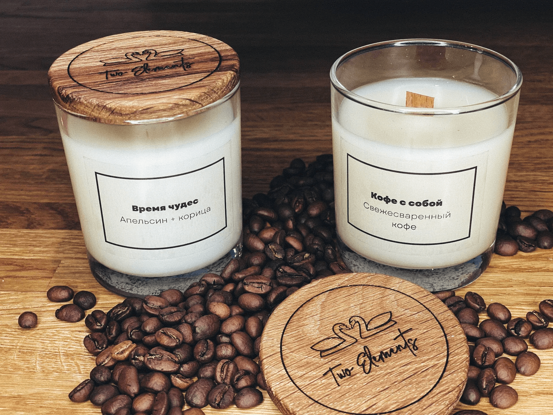
In reality, the identity came out even better than on the mockups: soft colors and neat typography work equally well on both the box and the can, and the warm wood texture adds tactility—something you can’t feel in the picture.
Bottom line
The Two Elements identity isn't just about aesthetics—it's about authenticity and care. These candles feel like a thoughtful gift and a design object at the same time.


Discussion